TextField
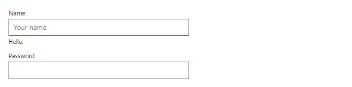
FreeSingle-line text input. Works with EditForm and DataAnnotations; the error message appears below the field.
Example
Parameters
| Parameter | Type | Description |
|---|---|---|
Class | string | Extra CSS classes added to the root element. |
Disabled | bool | Disables interaction. |
DisplayName | string | Name used in validation messages. |
HelperText | string | Hint shown below the field. |
Label | string | Visible label text (charts: accessible name; IconButton: accessible name and tooltip). |
Lines | int | Number of text lines; above 1 the field becomes a multiline text area. |
MaxLength | int? | Largest number of characters allowed. |
Placeholder | string | Placeholder shown when the field is empty. |
ReadOnly | bool | Shows the value but does not allow changes. |
Revealable | bool | Password fields only: adds a button that shows or hides the text. |
ShowCounter | bool | Shows the number of typed characters next to MaxLength. |
Style | string | Inline style added to the root element. |
Type | string | How the cell is drawn: Text, Check, Image, Progress, Link, Badge or Dropdown. |
Value | string | Current value. Use with @bind-Value. |
Events
| Event | Type | Description |
|---|---|---|
ValueChanged | EventCallback<string> | Raised when the value changes. |
Package
TextField is part of RayCraft Free. Package: RayCraft.Blazor. It comes from nuget.org. See Getting started.
Send feedbackVersion 1.0.3