Accordion
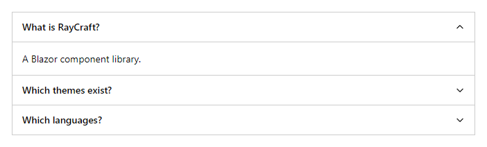
FreeExpandable sections. By default opening one closes the others; set Multiple to allow several.
Example
Parameters
Accordion
| Parameter | Type | Description |
|---|---|---|
ChildContent | RenderFragment | Content rendered inside the component. |
Class | string | Extra CSS classes added to the root element. |
Multiple | bool | Allows several selected rows: click, Ctrl+click, Shift+click, Shift+arrows, Ctrl+A (VirtualList). |
Style | string | Inline style added to the root element. |
AccordionItem
| Parameter | Type | Description |
|---|---|---|
ChildContent | RenderFragment | Content rendered inside the component. |
Class | string | Extra CSS classes added to the root element. |
Expanded | bool | Whether the item is open. Use with @bind-Expanded. |
Style | string | Inline style added to the root element. |
Title | string | Title text (drawer header, tab caption, column header, step caption). |
Events
AccordionItem
| Event | Type | Description |
|---|---|---|
ExpandedChanged | EventCallback<bool> | Raised when the item opens or closes. |
Package
Accordion is part of RayCraft Free. Package: RayCraft.Blazor. It comes from nuget.org. See Getting started.
Send feedbackVersion 1.0.3