Carousel
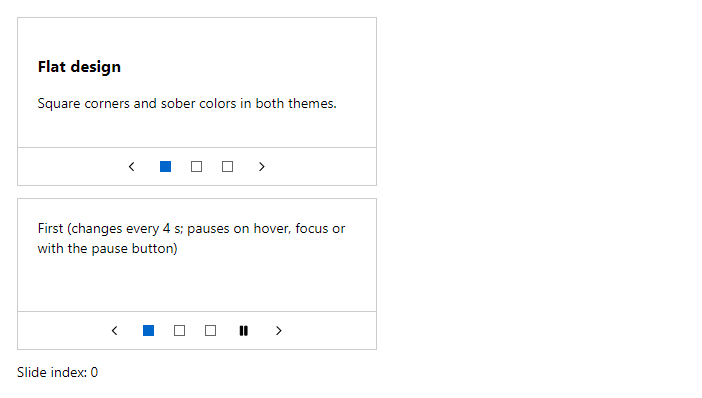
FreeSlides with previous and next buttons and indicators. Autoplay is optional; it pauses on hover and focus and has a pause button, as WCAG requires.
Example
Parameters
Carousel
| Parameter | Type | Description |
|---|---|---|
ActiveIndex | int | Index of the selected tab. Use with @bind-ActiveIndex. |
AutoplayInterval | int | Milliseconds between automatic slide changes; 0 (default) turns autoplay off. |
ChildContent | RenderFragment | Content rendered inside the component. |
Class | string | Extra CSS classes added to the root element. |
Label | string | Visible label text (charts: accessible name; IconButton: accessible name and tooltip). |
Style | string | Inline style added to the root element. |
CarouselSlide
| Parameter | Type | Description |
|---|---|---|
ChildContent | RenderFragment | Content rendered inside the component. |
Class | string | Extra CSS classes added to the root element. |
Style | string | Inline style added to the root element. |
Events
Carousel
| Event | Type | Description |
|---|---|---|
ActiveIndexChanged | EventCallback<int> | Raised when another tab is selected. |
Package
Carousel is part of RayCraft Free. Package: RayCraft.Blazor. It comes from nuget.org. See Getting started.
Send feedbackVersion 1.0.3