Popover
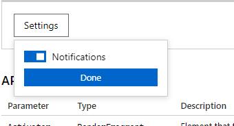
FreeFloating panel opened by an activator. Closes with Escape or a click outside.
Example
Parameters
| Parameter | Type | Description |
|---|---|---|
Activator | RenderFragment | Element that toggles the popover when clicked. |
ChildContent | RenderFragment | Content rendered inside the component. |
Class | string | Extra CSS classes added to the root element. |
Label | string | Visible label text (charts: accessible name; IconButton: accessible name and tooltip). |
Open | bool | Whether the drawer is shown. Use with @bind-Open. |
Style | string | Inline style added to the root element. |
Events
| Event | Type | Description |
|---|---|---|
OpenChanged | EventCallback<bool> | Raised when the drawer asks to close. |
Package
Popover is part of RayCraft Free. Package: RayCraft.Blazor. It comes from nuget.org. See Getting started.
Send feedbackVersion 1.0.3