Stepper
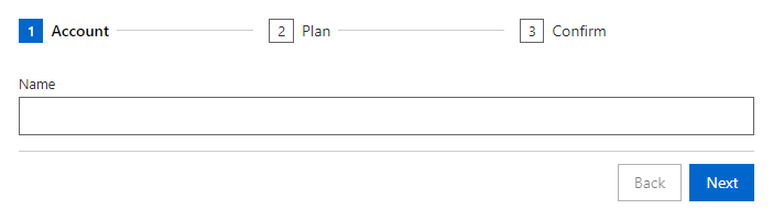
FreeGuides the user through a sequence of steps with Back and Next buttons.
Example
Parameters
Stepper
| Parameter | Type | Description |
|---|---|---|
ActiveIndex | int | Index of the selected tab. Use with @bind-ActiveIndex. |
AllowJumpBack | bool | Makes finished steps in the header buttons that reopen them. |
ChildContent | RenderFragment | Content rendered inside the component. |
Class | string | Extra CSS classes added to the root element. |
ShowButtons | bool | Shows the Back and Next buttons. |
Style | string | Inline style added to the root element. |
StepperStep
| Parameter | Type | Description |
|---|---|---|
ChildContent | RenderFragment | Content rendered inside the component. |
Title | string | Title text (drawer header, tab caption, column header, step caption). |
Validate | Func<Task<bool>> | Stepper step: runs before moving on, return false to stay on the step. DataGrid column: receives the item and the parsed value and returns an error text or null. |
Events
Stepper
| Event | Type | Description |
|---|---|---|
ActiveIndexChanged | EventCallback<int> | Raised when another tab is selected. |
OnCancel | EventCallback | Shows a Cancel button and raises this when it is pressed. |
OnFinish | EventCallback | Raised when Next is pressed on the last step. |
Package
Stepper is part of RayCraft Free. Package: RayCraft.Blazor. It comes from nuget.org. See Getting started.
Send feedbackVersion 1.0.3